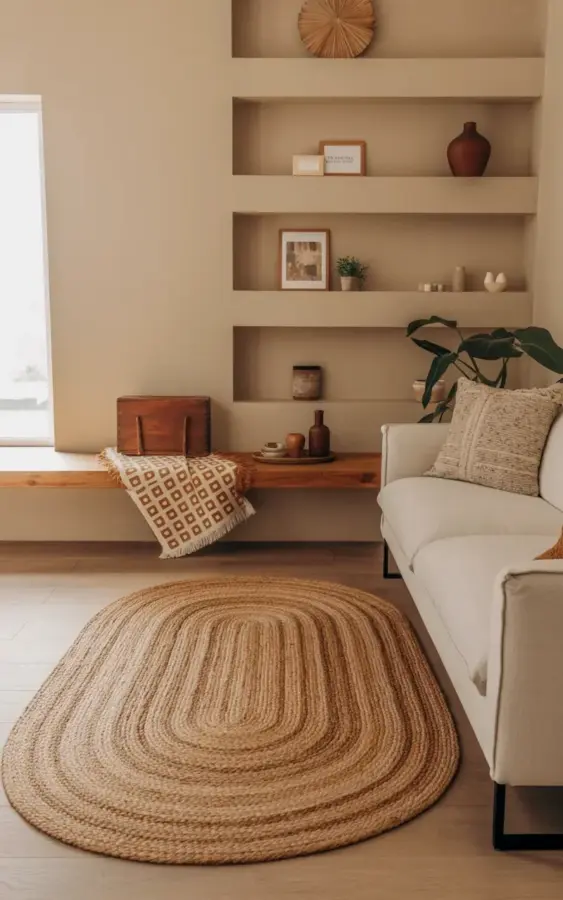
Look, the modern minimalist living room in that photo you keep seeing on Pinterest? It looks effortless, but it’s not. It took some trial and error to figure out why my own attempt at this exact style fell flat the first time. The missing pieces were a round jute rug and a basic wooden bench, sure. But the real secret was avoiding the handful of mistakes that make this look go from “curated” to “cluttered” in about five seconds flat. You can get that relaxed, magazine-worthy feel without buying a ton of stuff. You just need to know where to put what you already have.
Mistake #1: Choosing the Wrong Size for Your Jute Rug
Honestly, the rug size is where most people trip up. A circular jute area rug (like the one with the soft concentric oval patterns in that picture) anchors the whole seating area. If you buy one that’s too small, your furniture looks like it’s floating on a tiny island, disconnected and awkward. Too big, and you lose the light, airy feeling that defines the minimalist look. The general rule for a round rug under a sofa is to make sure at least the front two legs of your main seating sit on the rug. That’s it. That connection is what grounds the space.
I made the mistake of buying a rug that was way too small. My living room looked like it was wearing a beanie too small for its head. Remember to measure your sofa’s width and add about 24 inches. That gives you enough breathing room so the rug extends nicely past the edges, like you see in the photo with the light wooden flooring.
Mistake #2: Treating the Wooden Bench Like a Throwaway
That wooden bench under your built-in floating shelves isn’t just a place to drop your bag. It’s actually a crucial design anchor that bridges the gap between the floor and the wall. The mistake here is either pushing it flush against the wall (which looks one-dimensional) or pulling it too far out into the room, wrecking the walkway. Pull it out just enough so that you can see the floorboards continuing underneath it. That tiny sliver of negative space is what creates depth.
And please, don’t buy some overly polished, lacquered bench. The whole point of this style is to have something with a bit of natural grain, a bit of imperfection. My first bench was too dark, and it swallowed the light from the window. (My second one was a raw pine piece that I only lightly sanded. That one worked.)
Mistake #3: Overcrowding the Built-In Floating Shelves
Here’s the thing: floating shelves are supposed to feel like they’re floating. When you cram them full of books, candles, and trinkets, they start to look like a heavy, dusty bookcase. The trick is to keep the visual weight light. In the reference photo, you see a deliberate mix of empty space and a few select objects. I always suggest the “rule of three” for shelves, but with a twist. Instead of three separate items, group one large shape (like a wooden box) with one small, thin item (like a bottle) and one live element (the small potted plant).
On the shelf itself, give your objects room to breathe. Resist the urge to fill every inch. A minimalist room thrives on emptiness. I have a friend who filled her shelves with books stacked horizontally and vertically. It looked fantastic in a maximalist or library context, but it completely killed the minimalist vibe she was going for. It turned the room into a storage unit.
Mistake #4: Styling the Bench Like a Catalog Display
The bench is not a display case. It’s a functional piece of furniture that happens to look good. If you style it with three perfectly spaced identical vases, it looks staged, cold, and uninviting. Instead, aim for a look that feels collected over time. That means mixing textures and shapes that are slightly unexpected. The photo gets it right by combining a plush, geometric throw blanket draped over the center with a small stack of items at the end. Here is the exact break down that works:
- A wooden box for texture and height.
- A dark glass bottle for contrast against the tan jute rug and light bench.
- A small potted plant for life, but keep it off-center. Nobody sits exactly in the middle anyway.
Don’t try to make it perfect. Just make it look like you set it down and walked away.
Mistake #5: Letting the Sofa Fight the Bench for Attention
In the photo, you’ve got that white modern sofa with black metal legs sitting opposite… well, technically beside the bench, but in the same visual field. The mistake would be introducing a sofa with a heavy, upholstered base that touches the floor. That creates a solid, massive block that takes away from the airiness of the wooden bench and the jute’s texture. You need furniture that lets light pass under it. Those skinny black metal legs do a lot of heavy lifting. They open up the space.
If you already have a heavy sofa, you can fix this by adding a rug that has a lighter color or a looser weave to try and break up that mass. But honestly, the easiest fix is to just make sure your sofa isn’t too visually tall. It should feel low and grounded, leaving the upper half of the room for the eye to wander up to the shelves. Height balance is key to avoiding the overcrowded look, even if you don’t have a ton of stuff.
The Biggest Mistake: Thinking You Need More Stuff
Here’s a confession: I spent weeks buying decorative objects for my living room, convinced that I just hadn’t found the “right” pieces yet. What I actually needed was to delete. Removing things is harder than adding them, but it’s the only way to achieve this specific, calm aesthetic. The items in this look are all muted earth tones, natural materials, and quiet textures. A bright red plastic vase? It would stand out for all the wrong reasons. The reason the jute rug, the wood, and the beige walls work together is that they share a common, understated color language.
When you look at the image, you’ll notice the throw blanket has brown and white squares. That pattern is the only “loud” thing in the room. It’s the focal point. If you add any more patterns, you dilute the impact of the one geometric throw. The goal isn’t to add more. The goal is to let the few things you have actually shine. So, choose one accent pattern, and then, just stop. Don’t browse for more. Just let the room exist as it is.
Putting It All Together for Your Space
So, to recap the entire process: pick your spot, lay down a jute rug that’s the right size, and pull your bench away from the wall just a little. Clear the clutter from your shelves and keep only a couple of meaningful objects. Drape a textured throw over the bench, toss down a tiny potted plant, and then trust the process. It works. It really does. The homes we see online aren’t made up of expensive, rare finds. They’re almost always made up of simple materials arranged thoughtfully, and that’s something you can absolutely do this weekend. Just save this idea for your next refresh and give it a try.
#modernminimalist #juterug #livingroomdecor #minimaliststyle #homestyling
Leave a Comment