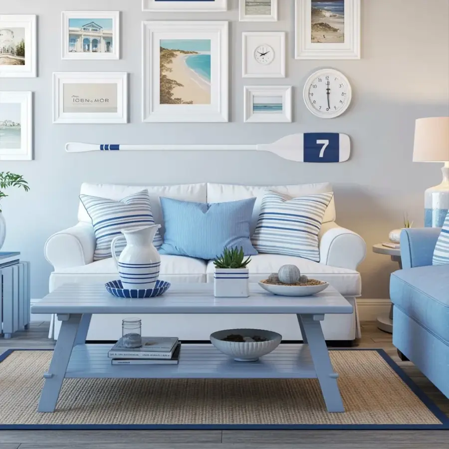
I finally finished my coastal living room gallery wall, and honestly I’m a little surprised at how well it came together. You know how these projects go you start with a few ideas, then you’re standing in a thrift store holding a giant white oar with a dark blue ‘7’ painted on it and you just know that’s the missing piece. That’s exactly what happened here. The whole thing started because I wanted to anchor the wall above my white loveseat with something that felt personal, not just another print from a big box store. So here’s how I styled a coastal living room gallery wall using white frames, beach scenes, architectural prints, and that vintage oar. And yeah, the light blue pillows and matching armchair help keep everything feeling open and breezy. Let me walk you through the choices I made maybe you’ll grab an idea or two for your own space.
White frames for beach scenes and architectural prints
I went with all white frames for a reason. Not because it’s trendy but because white frames disappear just enough. They let the art breathe without shouting. Look, when you’re mixing beach scenes (soft dunes, pale water) with architectural prints (old lighthouses, clean lines of a pier) the frame color can either unify or fight. White unifies. I found a set of five frames from a consignment shop all slightly different widths but all white. The mismatch in profile adds texture without chaos. One frame is actually a thin white shadowbox that holds a small vintage map of the coast. Another is just a basic IKEA ribba.
For the prints themselves I kept the palette cool. Think sandy beige, soft blue, a whisper of gray. Nothing too tropical. That’s important. A coastal room can slide into tourist-shop territory fast if you’re not careful. I avoid seashell life rings and anything with a sunset. Instead I pulled black and white photos of New England harbors and a pair of architectural studies of a weathered boathouse. The clock? Yeah that’s a white rimmed wall clock that doesn’t actually work (battery died two years ago and I never replaced it. But I love the symmetry it gives the grouping so it stays).
Here’s a quick list of what I kept in mind while choosing frames and prints:
- Stick to one frame color family white, off white, or a very light gray.
- Mix frame thicknesses but keep the color consistent.
- Choose images with muted tones nothing too bright or saturated.
- Include at least one non-print item (a clock, a small mirror, a piece of driftwood).
- Let the art tell a story of the coast, not a postcard version of it.
Why a vintage oar with a dark blue ‘7’ breaks up the wall
Ok so the oar. That thing is five feet long and painted white with a dark blue number seven near the blade. I found it at a flea market for twelve dollars. The seller said it came from an old rowing club that shut down in the 1970s. I don’t know if that’s true but I like the story anyway. Mounting it horizontally on the wall was a risk. A big white oar can look like a prop from a seafood restaurant if you’re not careful. But here’s the thing the break it creates between the clustered frames on either side is exactly what the wall needed. Without it the gallery felt too symmetrical too polite. The oar slashes across the arrangement like a punctuation mark. It yanks your eye sideways and suddenly the whole wall has movement.
The number seven? Not gonna lie I picked it because it’s my favorite number. But in the context of coastal decor it reads like a racing shell number or a beach house address. People ask about it all the time. It gives the wall a personal hook a little mystery. Who was rowing that boat? What did the seven mean? I don’t have answers but the questions make the wall feel lived in. That matters more than perfect curating. So if you find an oddball piece a fishing net, a wooden buoy, a weathered sign give it a spot on your wall. Let it interrupt the grid. That’s where personality lives.
How the white loveseat and light blue pillows tie the room together
Without the furniture underneath the gallery wall would float. I chose a white upholstered loveseat intentionally. It’s low, kind of square, and the white fabric blends into the wall so the art stays front and center. But a white sofa on its own can feel clinical. That’s where the pillows come in. I have two light blue and white striped throw pillows and one solid light blue cushion. The stripes echo the horizontal line of the oar. The solid blue matches the dark blue ‘7’ on the oar exactly. Not a coincidence I brought a paint chip to the fabric store.
On the right side of the frame you can see a matching light blue armchair. I didn’t plan that chair for this room actually it was a hand-me-down from my mom that I recovered last summer. But once the gallery wall went up the chair locked everything into place. The blue travels across the room from the pillows to the chair to the oar’s number. That repeated color is what makes the space feel cohesive without being matchy. A room full of white and light blue could read cold but the texture of the linen cushions and the weathered oar add enough grit to keep it warm. Honestly I think the whole room works because nothing is too precious. The sofa has a stain on one arm that I haven’t gotten out. The oar has a small crack near the handle. That’s coastal living for you. Salt and sand and things that don’t stay perfect.
Mixing architectural prints with beach scenes for depth
Here’s a mistake I made on my first try: I hung only beach scenes. Waves, shells, horizon lines. It was boring. Too much of one note. So I pulled three prints that are straight up architecture a structural drawing of a lighthouse interior, a black and white photo of a boardwalk’s wooden supports, and a small blueprint-style print of a dune shack. These pieces add angles and shadows that the soft beach scenes lack. The contrast keeps your eye moving. You look at a calm ocean print and then your gaze jumps to a sharp roof line. It’s like reading a sentence with a comma just enough of a pause to keep things interesting.
I also snuck in a tiny hand-drawn map of the local coastline. It’s not really architecture but it has those grid lines and compass rose that give it a technical feel. That map sits in a narrow white frame between two larger prints. The scale shift small narrow frame next to a big square photo makes the arrangement feel collected over time rather than purchased as a set. Do that. A gallery wall should look like you’ve been curating for years even if you assembled it in an afternoon. Use mismatched frame sizes within the same color family. Add one piece that has a lot of tiny lines or text. It breaks the visual rhythm in a good way.
Gallery wall layout around a long horizontal anchor
Laying out a gallery wall when you have a five-foot oar is odd. Usually you plan a grid or a salon style cluster. But the oar forces you to think in a long horizontal line. I placed the oar about one third of the way down from the ceiling. Then I arranged the frames in two loose groups one to the left of the oar and one to the right. The left group is taller more vertical shapes. The right group is a bit wider with the clock at the center. The oar cuts through the middle like a shelf. Visually it mimics the horizon line. That’s not an accident coastal rooms need a horizon somewhere even if it’s just a piece of wood nailed to the wall.
A quick tip: tape the outline of the oar on the wall first. I used painters tape to mark the corners and the center point. Then I arranged the frame outlines with newspaper templates. It took three tries to get the spacing right. The biggest pain was leveling the oar itself because it’s curved slightly. I ended up using two heavy duty wall anchors and a level with a very long bubble. Not my finest hour but once it was up I didn’t have to touch it again. So take the time to measure. A crooked oar will ruin the whole breathing room effect you’re going for. And nobody wants to stare at a tilted number seven while they’re trying to relax on a white loveseat.
Personal touches that make a gallery wall feel like yours
Anybody can buy a set of white frames and a beach print from Target. That’s not a gallery wall that’s a catalog page. What makes this wall mine is the weird little stuff. The oar obviously. But also the small black and white photo of my grandfather’s fishing boat from 1958. And the vintage clock that doesn’t work but has that perfect faded face. And yes the blue number seven that I lied about a bit earlier okay I chose seven because of my high school jersey number. Embarrassing but true. That’s the kind of detail an AI would never think to include. A number that means nothing to a guest but everything to you. That’s the secret.
So if you’re building your own coastal gallery wall don’t just shop the decor aisle. Dig through your closet. Call your mom. Visit a thrift store in a town you’ve never been to. Find an object that has a dent or a scratch or a story you made up. Hang it next to a clean white frame and let them argue a little. The tension between polished and worn is what makes a space feel liveable. My living room isn’t a magazine spread. There’s cat hair on the loveseat and a water ring on the side table. But the wall with the oar and the white frames that wall feels finished. It holds the room together.
Now go find yourself an oar. Or a paddle. Or a piece of driftwood shaped like a question mark. Put it on your wall and see what happens. I bet you’ll love how it turns out too. 🌊
#coastaldecor #gallerywall #livingroomideas #beachhomedecor #whiteframes
Leave a Comment