Picture this: you walk into a kitchen that should feel breezy and bright, and instead it hits you like a cold, sterile waiting room. White cabinets, white marble, white backsplash, boom, it’s all white. That’s the biggest coastal kitchen mistake I see people make, they forget that beachy doesn’t automatically mean lifeless, it needs warmth to actually feel like a home. A coastal kitchen needs something rough, something woven, something with a little wood grain to ground the space and keep it from feeling like a doctor’s office.
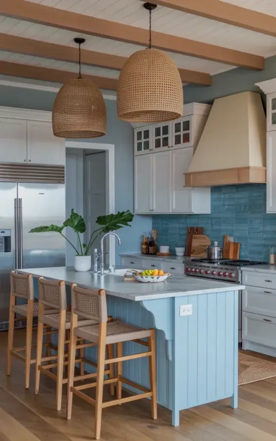
The kitchen in that photo gets it exactly right. A light blue island with a white marble top, surrounded by woven rattan pendants hanging from a wooden ceiling beam. It’s not a perfect, sterile showroom, it’s a real room with texture and light and just enough visual noise, and that’s what makes it work. Let me walk you through why this specific combo works and how you can steal the idea without losing your mind (or your budget) in the process. Look, I’m going to assume you’ve never designed a kitchen before, so I’ll explain it all from the beginning.
Why Rattan Pendants Do More Than Just Hang There
Honestly, if there’s one thing I’d tell you to steal from this photo, it’s the rattan pendants. They’re not just there to throw light onto the counter, they’re there to break up all the hard, glossy surfaces in a kitchen. Glass-front cabinets, marble countertops, tile backsplashes, they all reflect light and feel slick to the eye. Rattan throws that off. It’s rough, it’s textured, it catches the light differently, and it adds a layer of visual softness that paint alone can’t achieve.
The scale matters too. These aren’t tiny little pendant lights hovering awkwardly above the island. They’re big, loosely woven domes that feel almost sculptural. They hold their own space in the room and they anchor the whole island below them. If you’re choosing your own, don’t go too small. A small rattan pendant over a large island will just look like a lost lamp, trust me, I’ve made that exact mistake in my own dining nook. Go a little bigger than feels right, and hang them lower than you think, that’s where the cozy factor comes from.
Now, if you can’t do real rattan, don’t panic. There are so many good woven mimics out there, seagrass, bamboo, even some textured paper shades that give you the same vibe for a fraction of the cost. The point isn’t the expensive brand, it’s the material and the shadow pattern it throws on the ceiling. Good lighting in a kitchen isn’t just about brightness, it’s about creating those interesting shadow shapes that make a room feel layered and lived-in.
The Blue Island Trick Nobody Tells You
People get so scared of color in a kitchen, especially in a coastal style where the default is white on white on white. But a blue island is the perfect compromise because it’s a piece of furniture, not a wall. You’re not committing to a cobalt cave, you’re painting one central piece that already gets all the attention. The light blue in this photo is fantastic because it’s not too bright and not too gray, it sits right in that sweet spot that reminds you of sea glass or a hazy morning sky.
The marble countertop on top does some heavy lifting here. White marble with soft veining keeps the island from feeling heavy, and it gives your eye a clean place to rest after taking in the blue paint. If you want to copy this look with a smaller budget, you don’t need real marble at all. A white quartz with gray veining will give you the same calm, airy feeling and honestly, it’s easier to maintain anyway. Marble stains if you look at it wrong, quartz just keeps living.
One thing I always suggest, paint your island a slightly different shade than you think you want. A little more muted, a little less saturated. The color always reads bolder on a large surface than it does on a tiny paint swatch. I have a weird little habit of holding the paint chip next to a piece of driftwood I collected years ago, if they don’t fight each other, the color tends to work. Try that, it sounds odd but it actually helps.
What the Beige Range Hood Is Doing in This Kitchen
This is the detail that most people completely ignore when they look at this photo, and it’s honestly my favorite part. The beige wooden range hood sits right above a professional-grade stovetop with red knobs, and it should clash, but it doesn’t. Here’s the thing, the beige hood is doing duty as the “warmth anchor” for the entire wall. The white cabinets and blue glass tile are all cool tones, so if that wall were all white, the kitchen would tip over into cold territory real fast.
The red knobs on the stove are another small but mighty detail. They’re the only pop of strong color in the whole kitchen. That’s intentional, a single saturated accent is way more effective than five different colored appliances. The red in the knobs echoes the warm undertones in the wood and rattan, so the whole room holds together even though the palette is technically all over the place. Blue, white, beige, caramel, red, it shouldn’t work, but because every element has a warm undertone, it just does.
If you’re designing your own kitchen, think about that one wall. The area above your stove is like a focal billboard, don’t just paint it and walk away. Give it a treatment, a wood surround, a different tile pattern, or at least a warm neutral that pulls the eye up. It changes the entire feeling of the room.
Mixing Blue Glass Tile With Rustic Wood Without Making It Clash
The blue glass backsplash in this photo could have been a disaster. Glass tile is shiny, glossy, and leans very modern. Rustic wood is the exact opposite, it’s matte, organic, and leans very traditional. But here’s why it works, they share the same color temperature. The blue is more of a soft aqua, not a bold electric blue, so it doesn’t fight with the wood. It’s like they’re both speaking the same language but with different accents.
The trick is balance. You can’t cover every surface in glass and every surface in wood, you need to pick your spots. Here, the glass tile is a modest strip behind the stove, not the whole backsplash. The wood appears in the ceiling beam, the stools, and the hood, and it never overwhelms the space. If you’re nervous about mixing two strong materials, just give each one one specific job to do. The wood warms the room, the glass brings in that crisp, watery coastal light.
And for the love of all that is good, don’t try to match the blue in the tile to the blue in the island. Make them different, slightly, deliberately. When they almost match but don’t quite, it looks intentional and collected over time. When they match perfectly, it looks like a mass-produced furniture store display. Anyway, that’s my rule and I’m sticking to it.
How to Copy This Exact Look Without a Designer
Here is the honest version, you do not need a designer to make this kitchen work. You need three things: a blue island, a woven light fixture, and at least two pieces of wood in the room. Start there and you’re already ahead of most people. Here’s a quick grocery list, if you want to call it that, for the look:
- Pick a muted blue paint for the island, something with gray undertones, not purple and not neon.
- Swap any plain pendant light over the island for a rattan or seagrass dome. Bigger is better, trust the process.
- Add one wooden accent, either a small shelf, a stool, or a cutting board leaning against the backsplash, one is enough.
- Stick to white cabinets with a simple, clean shaker door style so the wood and blue stay the stars of the show.
Now here’s the part most people skip, the tiny styling details. Look at the photo again. The wooden stools aren’t perfectly lined up, there’s a subtle lived-in vibe that comes from natural fibers and matte finishes. It’s not a space designed for a magazine cover, it’s a space designed for sitting down and having another cup of coffee. You want to get that same easy feeling, so don’t over-decorate the counter. One or two wooden cutting boards, a small plant, maybe a ceramic vase, and then stop. Let the materials do the talking.
The ceiling beam is a brilliant addition, and I know not everyone can just add one. If you can’t, don’t sweat it. You can fake that energy with a wooden floating shelf on the open wall or even a thick wooden picture frame that mimics the line of a beam. In fact, one of my favorite tricks is to hang the rattan pendants from a simple black or brass ceiling plate and then paint the ceiling itself a warm, creamy off-white, like a soft oatmeal. It gives you the warm shadow that a beam would give you, without the carpentry bill.
Now, about the stools. Rattan stools with wooden frames are a brilliant, classic coastal accent, but they’re not exactly built for lounging for hours. Here’s my honest recommendation: buy just two and mix them with one extra-comfy upholstered stool. That combo is more realistic for how people actually live. The rattan keeps the coastal look, and the cushioned one keeps your back from hating you. And that mix of materials, that’s the whole coastal style in a nutshell. A breezy, light-filled space that still feels warm and grounded, that’s what you’re after.
Alright, here’s the deal. A coastal kitchen doesn’t need to be cold and it doesn’t need to be expensive. It needs to be honest, and this photo is honest about how warmth wins every time. So go grab a paint swatch, or sketch out your lighting plan, and build something that feels like a house you’d actually want to be in. Save this idea for your next kitchen refresh, you’ll be glad you did when those rattan pendants finally go up.
Leave a Comment