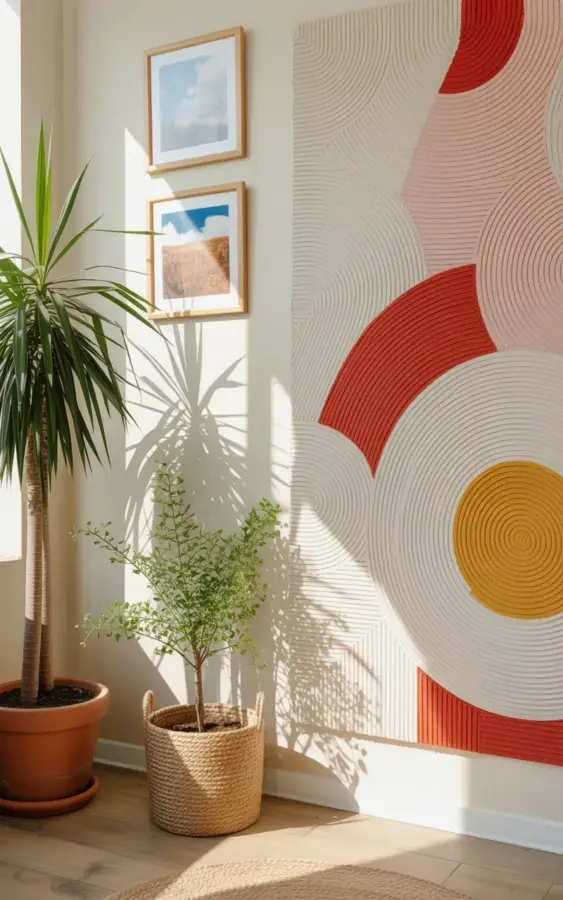
Ok so I finally tackled this corner with jutedecor and natural textures, and honestly the mistakes I made before this got it right are embarrassing. Before, it was just a blank wall with a speaker and a suspicious dust collection. Now it’s got a palm in terracotta, a woven rug below, and that gorgeous abstract art in coral and mustard. The geometric shadows from my window shift all day, and it feels like the room finally got dressed. If your corner looks lifeless, this is the common-mistakes guide, written by someone who bought the wrong rug twice.
Start With the Wall, Not the Cart
The biggest mistake I see is buying a rug first because it’s cheap and cute. Look, I get it. That woven jute circle is tempting, but it will not save a blank wall. The wall is the first thing your eye lands on, so it needs a statement anchor before anything touches the floor. In my case, the large abstract art does that job. It has those circular and curved patterns in cream, coral, red, and mustard, with a textured surface that catches light from the window. That piece carries the whole corner, and everything else just supports it.
So before you add anything else, ask yourself: does the wall have a voice? If not, start there. Not gonna lie, I almost put a shelf on that wall because I was scared of a big empty space. But a shelf would have just given me more clutter. One bold art piece is braver.
Abstract Art: Don’t Match, Coordinate
Another mistake is picking abstract art that exactly matches your couch. You don’t want a living room that looks like a furniture showroom. Pinterest is full of abstractart that looks gorgeous in a thumbnail but weird in a real room. Use your room colors as a guide, not a rule. My living room has a burnt orange blanket and ochre pillows, and the art pulls in coral and mustard with a little red. It feels connected, but not repetitive.
The art I chose has a dimensional, almost sculpted quality. That texture matters more than people think. Flat prints can feel thin, while a piece with raised paint gives the wall depth. And yes, you can put two framed landscape artworks above the big one. I did, and they show blue skies and natural scenes that pull the eye upward. Just keep the big piece lower and don’t line up the small frames too perfectly. A slight offset keeps it human.
Before you buy anything, run through these three checks:
- Does it share at least two colors with the rest of the room?
- Is it large enough to anchor the wall? If it’s smaller than a pillow, keep looking.
- Would you still like it if it matched nothing at all? Because trends fade, but that weird painted circle should still make you happy.
The Palm in Terracotta Needs a Job, Not Just a Spot
A plant in the corner can look like it’s hiding from something. That is the worst placement mistake. The plant should feel like it belongs there, not like it’s waiting for a bus. My tall palm has long green fronds that lean slightly toward the window, and I rotate it every time I water. The terracotta pot
#jutedecor #bohojute #naturaldecor #livingroomstyling #abstractart
Leave a Comment