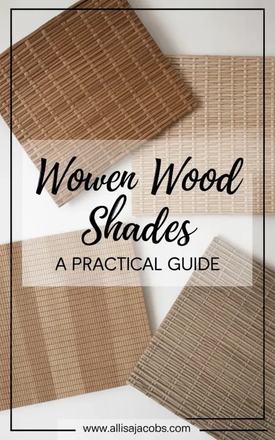
I spread four woven wood shade samples across my kitchen table last Tuesday. The morning light hit them just right, and I finally understood why people obsess over these things. If you’re shopping for woven wood shades, you already know the struggle: tiny swatches online never show the real texture. That’s why getting actual shade samples in your hands changes everything. Let me walk you through what I learned from comparing these four side by side, because honestly, the differences were way bigger than I expected.
Comparing Woven Wood Shade Textures: Tight Weave vs. Striped Patterns
The first thing I noticed? Texture is not just texture. Look, there’s a massive difference between a tight horizontal weave and a vertical striped pattern. The top left sample in my pile had that dense, almost matted horizontal weave in a warm brown. It felt sturdy, like a basket you could trust. Next to it, the top right sample used the same tight weave but in a light beige, and it felt entirely different. Softer. More airy. Same construction, different vibe.
Then there are the striped ones. Bottom left and bottom right. These vertical line patterns feel looser, more open. They let more light filter through. I kept running my fingers over them. The tight weave? Solid. The stripes? Playful. Honestly, one is not better than the other, but they serve totally different moods.
Choosing Between Horizontal and Vertical Weaves for Window Treatments
Ok so here’s the thing: horizontal weaves are classic. They’re what you picture when you think “natural blinds.” But vertical stripes? That’s where the personality lives. I’ve got a small living room window that gets harsh afternoon sun, and for that, I’d pick the tight horizontal weave because it blocks more glare. But my bedroom? That room needs soft, diffused light in the morning, so I’d go with the vertical striped window treatments in that lighter beige tone.
One weird thing I discovered: the vertical striped samples looked completely different when I held them up against a window versus flat on the table. The shadows create an illusion. So if you’re ordering samples, please hold them against actual light before deciding. I almost made a mistake with the darker stripe sample (bottom right) because it looked too dark on the table, but against the window it was perfect. Not too heavy. Just right.
Natural Blinds Color Options: Warm Brown, Light Beige, and Everything Between
Let’s talk color because it’s not just beige vs. brown. The warm brown sample had these subtle undertones of amber and a tiny bit of green, like bamboo that has aged a little. The light beige sample (top right) almost looked cream in direct light and a cool grayish beige in shade. Annoying? Yes. But also useful. Here’s what I noted about each sample’s color behavior:
- Warm brown tight weave: pulls orange/gold in warm light, looks chocolatey in dim light. Great for cozy rooms.
- Light beige tight weave: neutral but tricky. It picks up wall color reflections like crazy. Next to my blue wall, it looked almost greenish.
- Light beige vertical stripe: airy, barely-there color. Ideal if you want the texture without the color shouting.
- Darker vertical stripe: a warm taupe with slight gray undertone. More modern than the brown one.
Moral of the story? Never trust a monitor. Hold the natural blinds sample exactly where you plan to install it. I did that for three days. My cat sat on them, too. No damage. That’s a testament to durability actually.
How to Use Shade Samples for Home Decor Decisions Without Losing Your Mind
Here’s a practical tip I wish someone had told me: get multiple samples of the same style in different colors. I thought one sample would be enough, but seeing them together is the only way. Arrange them on your floor, on your windowsill, against your furniture. Take photos at noon, at sunset, and with the lights on at night. Seriously. I have eleven photos on my phone that all show different shades of beige. It’s ridiculous but necessary.
Another thing: don’t ignore the backside of the sample. Some woven wood shades have a different backing, a lining that changes the look from outside. The samples I had were unlined, but if you’re adding a privacy liner, ask for a sample of that too. Because the texture from inside might not match what you expect from the front. I learned this the hard way when I ordered a different brand for a previous house and the liner made the whole shade stiff and plasticky. Never again.
And hey, if you have weird windows like mine (a tiny arched one in the hallway), cut a piece of paper to the approximate shape and tape the sample behind it. It helps visualize the final look. Sounds obsessive. It is obsessive. But it saved me from a costly mistake.
Mixing Textures: Can You Combine Different Weaves in One Room?
Short answer: absolutely yes. I have a friend who put tight horizontal weaves on her main windows and vertical stripes on a sliding glass door, and it worked because she kept the colors within the same family (light beige and warm brown). The key is not to have too many competing patterns. One room, two textures max. If you go with window treatments that differ in weave but share a similar tone, the eye reads it as intentional, not chaotic.
But I’ll tell you what I almost did wrong: I wanted to use the dark stripe sample for my kitchen and the light beige tight weave for the dining nook. They connect through an open arch. In my head, it was great contrast. In reality, when I held them up together from the archway, it looked like two different houses colliding. Too much. So I swapped the dark stripe for the warm brown tight weave instead. Much better. Smooth transition. Moral: always view samples together from the angle you’ll actually see them.
Why the Lighting in Your Room Changes Everything for Woven Wood Shades
I cannot stress this enough. The sample on the white background in the product photo looks one way. On my south-facing window at 3pm? Completely different. The warm brown sample turned almost coppery in direct sun. The light beige stripe sample looked washed out and lost all its texture. Meanwhile, in my north-facing bedroom, the same light beige stripe popped beautifully. So it’s not just the sample itself. It’s your specific light.
Here’s a weird trick: set your phone camera to black and white and take a picture of the samples in the room. This removes the color distraction and lets you see the texture contrast clearly. I did this and realized the two beige samples were nearly identical in texture density when you ignore color. That saved me from buying two similar shades. I went with the warmer brown for one room and kept the lighter beige for another. Saved money too.
Final Thoughts on Choosing the Right Woven Wood Shade Texture for Your Home
After a week of living with these samples taped to my windows, I finally made my choice. I went with the tight horizontal weave in warm brown for my office (needs privacy and coziness) and the light beige vertical stripe for my bedroom (needs soft light and a relaxed feel). The samples are still sitting on my desk because I keep staring at them. They’re like little works of art, honestly.
So which texture catches your eye? I’d genuinely love to know. Drop a comment or send me a message. And if you’re still unsure, just order a handful of samples. It’s the only way. Your windows will thank you.
#woven wood shades #window treatments #natural blinds #shade samples #home decor