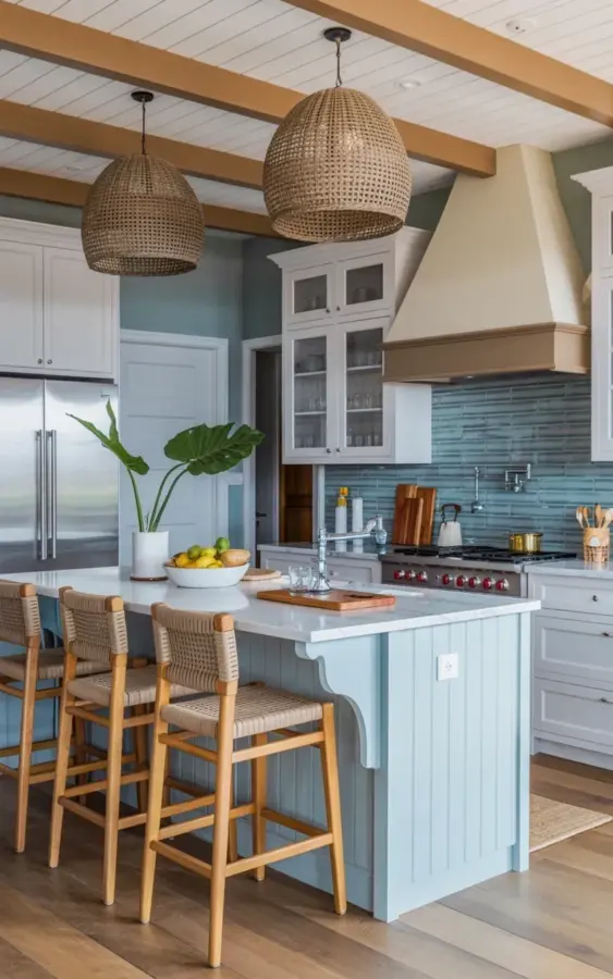
I have seen plenty of kitchens that try too hard to look coastal. They throw in some seashells, pick a pale blue, and call it a day. But a blue island coastal kitchen with rattan pendant lights can feel either perfectly breezy or painfully mismatched depending on a few small decisions. That light blue island, white marble countertop, and natural woven pendants work together only when you avoid the common stumbles. Let me walk you through the mistakes I see most often, so yours lands on the right side of that line.
Mistake #1: Picking the wrong blue for your kitchen island
You see a photo of a light blue island and think any pastel will do. Wrong. The blue in this kitchen is not a baby blue or a dusty gray-blue. It is a clean, slightly muted sky tone with a hint of warmth. If you choose something too cool or too saturated, the whole room feels off. That blue needs to play nice with warm wood tones and white cabinetry.
To avoid this mistake, test your blue paint on a large piece of foam board and lean it against your cabinets for a few days. Look at it in morning light, afternoon light, and under your pendant lights at night. A blue that reads as a soft weathered denim (not a crayon color) will read as coastal without screaming beach theme.
Mistake #2: Skipping texture variety in a coastal kitchen
Coastal design is not just about color. It is about texture, and this kitchen nails that with the woven rattan pendants, the beige wood range hood, and the glass tile backsplash. One common error is to use only smooth surfaces: flat paint, slick countertops, glossy backsplash tiles. The result feels sterile, not breezy.
To get the right balance, mix at least three distinct textures. Here is what works like in the photo:
- Natural fiber: rattan pendants and bar stools add a handwoven, organic feel.
- Stone: white marble countertop brings a cool polished surface with subtle veining.
- Wood: the beige wooden range hood and stool frames warm up the crisp white cabinets.
- Glass: blue glass tile backsplash catches light and adds a watery shimmer.
If all your elements are smooth and reflective, throw in at least one rough or woven piece. Even a linen roman shade or a seagrass mat underfoot can save the room from feeling like a showroom.
Mistake #3: Hanging rattan pendant lights at the wrong height
Two woven rattan pendant lights hang from a wooden beam ceiling in the reference photo. I see people hang these too high, trying to avoid bumping heads, or too low, blocking the view across the island. Neither works. When pendants float in midair with no visual anchor, the kitchen loses its focal point.
For an island that is around 36 inches tall, the bottom of your pendant should hang 30 to 36 inches above the countertop. That puts the light close enough to illuminate the workspace but high enough to not interfere with conversation. If your ceiling has a beam, center the pendants on the beam for a clean line. The woven shade should be visible at eye level so the texture becomes part of the room, not just a ceiling detail.
Mistake #4: Forgetting the backsplash as a design anchor
The blue glass tile backsplash in this kitchen runs from the professional stovetop down to the counter. It is not just a splash guard. It is the main color bridge between the light blue island and the white cabinets. A common mistake is to choose a neutral white or beige backsplash and hope the island does all the heavy lifting. That usually leaves the kitchen feeling flat.
To make your backsplash work, pick a tile that echoes the island color but in a lighter or more transparent form. Glass subway tile in a soft blue lets light bounce and creates depth. Run it all the way from the counter to the underside of the upper cabinets, not just a small strip behind the stove. That continuous line ties the whole space together, especially when you have glass-front upper cabinets that let the tile peek through.
Mistake #5: Treating the range hood as an afterthought
That beige wood range hood is not an accident. It grounds the stove area and repeats the wood tones from the bar stools and the ceiling beam. Too many homeowners pick a stainless steel hood because it is standard, and then wonder why the kitchen feels cold and disjointed. The hood is a visual anchor, not a utility box you hide.
Choose a hood that matches or complements your cabinet color or your natural wood accents. A wooden hood in a warm beige or light oak makes a statement without shouting. If you have white shaker cabinets like in this kitchen, a painted wood hood in a soft neutral (beige, ivory, or even the same blue as the island) can work too. Just avoid mixing cool stainless steel with warm wood and rattan. It clashes every time.
Mistake #6: Ignoring bar stool comfort and scale
Three woven rattan bar stools with wooden frames sit at the island in the photo. They are not just decoration. People will sit there for breakfast, for homework, and for summer gatherings. A common error is to buy stools that are too tall or too short, or that have a seat depth that makes you slide off. Rattan is gorgeous, but if the seat is too narrow or too hard, nobody uses them.
Measure your island overhang. For legroom, you need at least 12 inches of clearance between the counter edge and the stool seat when pulled in. Standard counter height is 36 inches, so stools should have a seat height of 24 to 26 inches. For a comfortable seat, look for a depth of at least 16 inches, and consider adding a cushion if the woven seat is too rough. The wooden frame should be solid enough that the stool does not wobble when someone leans back. That small investment in comfort makes your kitchen the gathering spot you want it to be.
Mistake #7: Overlooking the workflow for summer gatherings
A professional stovetop with red knobs sits on the marble countertop. That means someone is cooking. But if the island is crowded with decor and the pathways are tight, a summer gathering turns frustrating. The mistake is designing for looks first and movement second. You want people to flow from the sink to the stovetop to the island without dodging chairs and stools.
Plan for at least 42 inches of clearance between the island and the perimeter counters. Leave the island top mostly clear when guests are over. Use the stools as seating only when needed, and push them in when not in use. Keep a serving tray on the far end of the island, not in the cooking zone. That way the person at the stovetop has room to work, and guests can grab a drink without getting in the way. Summer cooking should feel relaxed, not like a traffic jam.
A coastal kitchen with a light blue island, rattan lights, and natural textures can be exactly what you want for warm-weather entertaining. The trick is to avoid the temptation to overdo or underdo any one element. Get the blue right, mix your textures, hang your pendants at the right height, and choose functional pieces that people actually want to use. That is how a kitchen goes from looking coastal to truly living coastal.
If you are planning your own update, save this post for later and think through each of these points before you buy anything. And if you already have a blue kitchen island, I would love to hear how you worked the rattan in. Drop a comment below.
#coastalkitchen #bluekitchenisland #rattanlighting #coastalhomedecor #summerkitchen